4.1: User Input Controls
- Interaction design for user input
- Input controls and view focus
- Using buttons
- Using input controls for making choices
- Text input
- Using dialogs and pickers
- Recognizing gestures
- Related practical
- Learn more
Interaction design for user input
The reason you design an app is to provide some function to a user, and in order to use it, there must be a way for the user to interact with it. For an Android app, interaction typically includes tapping, pressing, typing, or talking and listening. And the framework provides corresponding user interface (UI) elements such as buttons, menus, keyboards, text entry fields, and a microphone.
In this chapter you will learn how to design an app's user interaction—the buttons needed for triggering actions, and the text entry fields for user input. In your design you need to anticipate what users might need to do, and ensure that the UI has elements that are easy to access, understand, and use. When your app needs to get data from the user, make it easy and obvious. Give the user whatever assistance possible to provide any input data, such as anticipating the source of the data, minimizing the number of user gestures (such as taps and swipes), and pre-filling forms if possible.
Make sure your app is intuitive; that is, your app should perform as your users expect it to perform. When you rent a car, you expect the steering wheel, gear shift, headlights, and indicators to be in a certain place. When you enter a room, you expect the light switch to be in a certain place. When a user starts an app, the user expects buttons to be clickable, spinners to show a drop-down menu, and text editing fields to show the onscreen keyboard when tapping inside them. Don't violate the established expectations, or you'll make it harder for your users to use your app.
This chapter introduces the Android input controls, which are the interactive components in your app's user interface. You can use a wide variety of input controls in your UI, such as text fields, buttons, checkboxes, radio buttons, toggle buttons, spinners, and more.
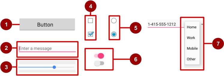
In the above figure:
- Button
- Text field
- Seek bar
- Checkboxes
- Radio buttons
- Toggle
- Spinner
For a brief description of each input control, see Input Controls in the developer documentation.
Input controls and view focus
Android applies a common programmatic abstraction to all input controls called a view. The View class represents the basic building block for UI components, including input controls. In previous chapters, we have learned that View is the base class for classes that provide support for interactive UI components, such as buttons, text fields, and layout managers.
If there are many UI input components in your app, which one gets input from the user first? For example, if you have several TextView objects and an EditText object in your app, which UI component (that is, which View) receives text typed by the user first?
The View that "has the focus" will be the component that receives user input.
Focus indicates which view is currently selected to receive input. Focus can be initiated by the user by touching a View, such as a TextView or an EditText object. You can define a focus order in which the user is guided from UI control to UI control using the Return key, Tab key, or arrow keys. Focus can also be programmatically controlled; a programmer can requestFocus() on any View that is focusable.
Another attribute of an input control is clickable. If this attribute is (boolean) true, then the View can react to click events. As it is with focus, clickable can be programmatically controlled.
The difference between clickable and focusable is that clickable means the view can be clicked or tapped, while focusable means that the view is allowed to gain focus from an input device such as a keyboard. Input devices like keyboards can't determine which view to send their input events to, so they send them to the view that has focus.
Android device input methods are becoming quite diverse: directional pads, trackballs, touch screens, keyboards, and more. Some devices, like tablets and smartphones, are primarily navigated by touch. Others, like the Google TV, have no touch screen whatsoever and rely upon input devices such as those with a directional pad (d-pad). When a user is navigating through a user interface with an input device such as directional keys or a trackball, it is necessary to:
- Make it visually clear which view has focus, so that the user knows where the input goes.
- Explicitly set the focus in your code to provide a path for users to navigate through the input elements using directional keys or a trackball.
Fortunately, in most cases you don't need to control focus yourself, unless you want to provide a set of text input fields and you want the user to be able to move from one field to the next by tapping the Return or Tab key. Android provides "touch mode" for devices that can be touched, such as smartphones and tablets. When the user begins interacting with the interface by touching it, only Views with isFocusableInTouchMode() set to true are focusable, such as text input fields. Other Views that are touchable, such as buttons, do not take focus when touched. If the user hits a directional key or scrolls with a trackball, the device exits "touch mode" and finds a view to take focus.
Focus movement is based on an algorithm that finds the nearest neighbor in a given direction:
- When the user touches the screen, the topmost view under the touch is in focus, providing touch-access for the child views of the topmost view.
- If you set an EditText view to a single-line, the user can tap the Return key on the keyboard to close the keyboard and shift focus to the next input control view based on what the Android system finds:
- The system usually finds the nearest input control in the same direction the user was navigating (up, down, left, or right).
- If there are multiple input controls that are nearby and in the same direction, the system scans from left to right, top to bottom.
- Focus can also shift to a different view if the user interacts with a directional control, such as a directional pad (d-pad) or trackball.
You can influence the way Android handles focus by arranging input controls such as EditText elements in a certain layout from left to right and top to bottom, so that focus shifts from one to the other in the sequence you want.
If the algorithm does not give you what you want, you can override it by adding the nextFocusDown, nextFocusLeft, nextFocusRight, and nextFocusUp XML attributes to your layout file.
- Add one of these attributes to a view to decide where to go upon leaving the view—in other words, which view should be the next view.
- Define the value of the attribute to be the
idof the next view. For example:<LinearLayout android:orientation="vertical" ... > <Button android:id="@+id/top" android:nextFocusUp="@+id/bottom" ... /> <Button android:id="@+id/bottom" android:nextFocusDown="@+id/top" ... /> </LinearLayout>
Ordinarily in a vertical LinearLayout, navigating up from the first Button would not go anywhere, nor would navigating down from the second Button. But in the above example, the top Button has defined the bottom button as the nextFocusUp (and vice versa), so the navigation focus will cycle from top-to-bottom and bottom-to-top.
If you'd like to declare a View as focusable in your UI (when it is traditionally not), add the android:focusable XML attribute to the View in the layout, and set its value to true. You can also declare a View as focusable while in "touch mode" with android:focusableInTouchMode set to true.
You can also explicitly set the focus or find out which view has focus by using the following methods:
- Call onFocusChanged to determine where focus came from.
- To find out which view currently has the focus, call Activity.getCurrentFocus(), or use ViewGroup.getFocusedChild() to return the focused child of a view (if any).
- To find the view in the hierarchy that currently has focus, use findFocus().
- Use requestFocus to give focus to a specific view.
- To change whether a view can take focus, call setFocusable.
- To set a listener that will be notified when the view gains or loses focus, use setOnFocusChangeListener.
Understanding focus with respect to input controls is essential for understanding how the on-screen keyboard works with text editing views. For example, depending on which attributes you use with an EditText view, tapping the Return key in the keyboard can either enter a new line, or advance the focus to the next view. You'll learn more about focus with text editing views later in this chapter.
Using buttons
People like to press buttons. Show someone a big red button with a message that says "Do not press" and the person will likely press it for the sheer pleasure of pressing a big red button (that the button is forbidden is also a factor).
You can make a Button using:
- Only text, as shown on the left side of the figure below.
- Only an icon, as shown in the center of the figure below.
- Both text and an icon, as shown on the right side of the figure below.
When touched or clicked, a button performs an action. The text and/or icon provides a hint of that action. It is also referred to as a "push-button" in Android documentation.

A button is a rectangle or rounded rectangle, wider than it is tall, with a descriptive caption in its center. Android buttons follow the guidelines in the the Android Material Design Specification—you will learn more about that in a later lesson.
Android offers several types of buttons, including raised buttons and flat buttons as shown in the figure below. These buttons have three states: normal, disabled, and pressed.

In the above figure:
- Raised button in three states: normal, disabled, and pressed.
- Flat button in three states: normal, disabled, and pressed.
Designing raised buttons
A raised button is a rectangle or rounded rectangle that appears lifted from the screen—the shading around it indicates that it is possible to touch or click it. The raised button can show text or an icon, or show both text and an icon.
To use raised buttons that conform to the Material Design Specification, follow these steps:
In your build.gradle (Module: app) file, add the newest appcompat library to the
dependenciessection:compile 'com.android.support:appcompat-v7:x.x.x.'In the above, x.x.x. is the version number. If the version number you specified is lower than the currently available library version number, Android Studio will warn you ("a newer version is available"). Update the version number to the one Android Studio tells you to use.
- Make your activity extend
android.support.v7.app.AppCompatActivity:public class MainActivity extends AppCompatActivity { ... } - Use the
Buttonelement in the layout file. There is no need for an additional attribute, as a raised button is the default style.<Button android:layout_width="wrap_content" android:layout_height="wrap_content" ... />
Use raised buttons to give more prominence to actions in layouts with a lot of varying content. Raised buttons add dimension to a flat layout—they emphasize functions on busy or wide spaces. Raised buttons show a background shadow when touched (pressed) or clicked, as shown below.

In the above figure:
- Normal state: In its normal state, the button looks like a raised button.
- Disabled state: When the button is disabled, it is grayed out and it's not active in the app's context. In most cases you would hide an inactive button, but there may be times when you would want to show it as disabled.
- Pressed state: The pressed state, with a larger background shadow, indicates that the button is being touched or clicked. When you attach a callback to the button (such as the OnClick attribute), the callback is called when the button is in this state.
Creating a raised button with text
Some raised buttons are best designed as text, without an icon, such as a "Save" button, because an icon by itself might not convey an obvious meaning. To create a raised button with text, use the Button class, which extends the TextView class.
To create a raised button with just text, use the Button class in your XML layout as follows:
<Button
    android:layout_width="wrap_content"
    android:layout_height="wrap_content"
    android:text="@string/button_text"
    ... />
The best practice with text buttons is to define a very short word as a string resource (button_text in the above example), so that the string can be translated. For example, "Save" could be translated into French as "Enregistrer" without changing any of the code.
Creating a raised button with an icon and text
While a button usually displays text that tells the user what the button is for, raised buttons can also display icons along with text.
Choosing an icon
To choose images of a standard icon that are resized for different displays, follow these steps:
- Expand app > res in the Project view, and right-click (or Command-click) drawable.
- Choose New > Image Asset. The Configure Image Asset dialog appears.
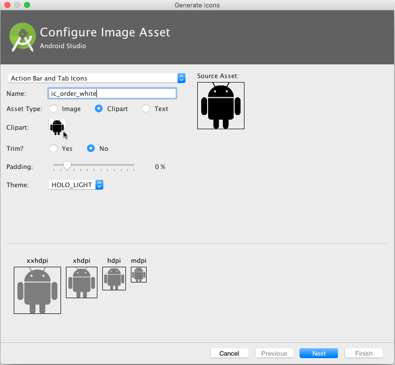
- Choose Action Bar and Tab Items in the drop-down menu of the Configure Image Asset dialog (see Image Asset Studio for a complete description of this dialog.)
- Click the Clipart: image (the Android logo) to select a clipart image as the icon. A page of icons appears as shown below. Click the icon you want to use.
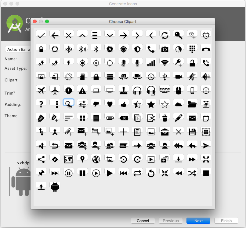
- You may want to make the following adjustments:
- Choose HOLO_DARK from the Theme drop-down menu to sets the icon to be white against a dark-colored (or black) background.
- Depending on the shape of the icon, you may want to add padding to the icon so that the icon doesn't crowd the text. Drag the Padding slider to the right to add more padding.
- Click Next, and then click Finish in the Confirm Icon Path dialog. The icon name should now appear in the app > res > drawable folder.
Vector images of a standard icon are automatically resized for different sizes of device displays. To choose vector images, follow these steps:
- Expand app > res in the Project view, and right-click (or Command-click) drawable.
- Choose New > Vector Asset for an icon that automatically resizes itself for each display.
- The Vector Asset Studio dialog appears for a vector asset. Click the Material Icon radio button, and then click the Choose button to choose an icon from the Material Design spec (see Add Multi-Density Vector Graphics for a complete description of this dialog).
- Click Next after choosing an icon, and click Finish to finish. The icon name should now appear in the app > res > drawable folder.
Adding the button with text and icon to the layout
To create a button with text and an icon as shown in the figure below, use a Button in your XML layout. Add the android:drawableLeft attribute to draw the icon to the left of the button's text, as shown in the figure below:
<Button
    android:layout_width="wrap_content"
    android:layout_height="wrap_content"
    android:text="@string/button_text"
    android:drawableLeft="@drawable/button_icon"
    ... />
![]()
Creating a raised button with only an icon
If the icon is universally understood, you may want to use it instead of text.
To create a raised button with just an icon or image (no text), use the ImageButton class, which extends the ImageView class. You can add an ImageButton to your XML layout as follows:
<ImageButton
    android:layout_width="wrap_content"
    android:layout_height="wrap_content"
    android:src="@drawable/button_icon"
    ... />
Changing the style and appearance of raised buttons
The simplest way to show a more prominent raised button is to use a different background color for the button. You can specify the android:background attribute with a drawable or color resource:
android:background="@color/colorPrimary"
The appearance of your button—the background color and font—may vary from one device to another, because devices by different manufacturers often have different default styles for input controls. You can control exactly how your buttons and other input controls are styled using a theme that you apply to your entire app.
For instance, to ensure that all devices that can run the Holo theme will use the Holo theme for your app, declare the following in the <application> element of the AndroidManifest.xml file:
android:theme="@android:style/Theme.Holo"
After adding the above declaration, the app will be displayed using the theme.
Apps designed for Android 4.0 and higher can also use the DeviceDefault public theme family. DeviceDefault themes are aliases for the device's native look and feel. The DeviceDefault theme family and widget style family offer ways for developers to target the device's native theme with all customizations intact.
For Android apps running on 4.0 and newer, you have the following options:
- Use a theme, such as one of the Holo themes, so that your app has the exact same look across all Android devices running 4.0 or newer. In this case, the app's look does not change when running on a device with a different default skin or custom skin.
- Use one of the DeviceDefault themes so that your app takes on the look of the device's default skin.
- Don't use a theme, but you may have unpredictable results on some devices.
If you're not already familiar with Android's style and theme system, you should read Styles and Themes. The blog post "Holo Everywhere" provides information about using the Holo theme while supporting older devices.
For a guide on styling and customizing buttons using XML, see Buttons (in the "User Interface" section of the Android developer guide). For a comprehensive guide to designing buttons, see "Components - Buttons" in the Material Design Specification.
Designing flat buttons
A flat button, also known as a borderless button, is a text-only button that appears flat on the screen without a shadow. The major benefit of flat buttons is simplicity — they minimize distraction from content. Flat buttons are useful when you have a dialog, as shown in the figure below, which requires user input or interaction. In this case, you would want to have the same font and style as the text surrounding the button. This keeps the look and feel the same across all elements within the dialog.
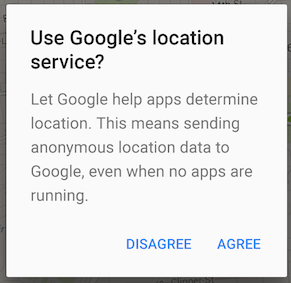
Flat buttons, shown below, resemble basic buttons except that they have no borders or background, but still change appearance during different states. A flat button shows an ink shade around it when pressed (touched or clicked).

In the above figure:
- Normal state: In its normal state, the button looks just like ordinary text.
- Disabled state: When the text is grayed out, the button is not active in the app's context.
- Pressed state: The pressed state, with a background shadow, indicates that the button is being touched or clicked. When you attach a callback to the button (such as the
android:onClickattribute), the callback is called when the button is in this state.Note: If you use a flat button within a layout, be sure to use padding to set it off from the surrounding text, so that the user can easily see it.
To create a flat button, use the Button class. Add a Button to your XML layout, and apply "?android:attr/borderlessButtonStyle" as the style attribute:
<Button
    android:id="@+id/button_send"
    android:layout_width="wrap_content"
    android:layout_height="wrap_content"
    android:text="@string/button_send"
    android:onClick="sendMessage"
    style="?android:attr/borderlessButtonStyle" />
Designing images as buttons
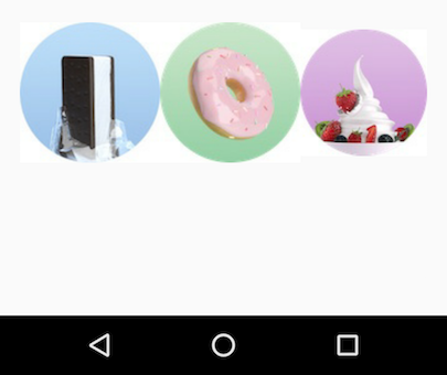
You can turn any View, such as an ImageView, into a button by adding the android:onClick attribute in the XML layout. The image for the ImageView must already be stored in the drawables folder of your project.
If you are using multiple images as buttons, arrange them in a viewgroup so that they are grouped together. For example, the following images in the drawable folder (icecream_circle.jpg, donut_circle.jpg, and froyo_circle.jpg) are defined for ImageViews that are grouped in a LinearLayout set to a horizontal orientation so that they appear side-by-side:
<LinearLayout
        android:layout_width="match_parent"
        android:layout_height="match_parent"
        android:orientation="horizontal"
        android:layout_marginTop="260dp">
        <ImageView
            android:layout_width="wrap_content"
            android:layout_height="wrap_content"
            android:src="@drawable/icecream_circle"
            android:onClick="orderIcecream"/>
        <ImageView
            android:layout_width="wrap_content"
            android:layout_height="wrap_content"
            android:src="@drawable/donut_circle"
            android:onClick="orderDonut"/>
        <ImageView
            android:layout_width="wrap_content"
            android:layout_height="wrap_content"
            android:src="@drawable/froyo_circle"
            android:onClick="orderFroyo"/>
    </LinearLayout>
Designing a floating action button
A floating action button, shown below as #1 in the figure below, is a circular button that appears to float above the layout.
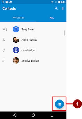
You should use a floating action button only to represent the primary action for a screen. For example, the primary action for the Contacts app's main screen is adding a contact, as shown in the figure above. A floating action button is the right choice if your app requires an action to be persistent and readily available on a screen. Only one floating action button is recommended per screen.
The floating action button uses the same type of icons that you would use for a button with an icon, or for actions in the app bar at the top of the screen. You can add an icon as described previously in "Choosing an icon for the button".
To use a floating action button in your Android Studio project, you must add the following statement to your build.gradle (Module: app) file in the dependencies section:
compile 'com.android.support:design:23.4.0'
To create a floating action button, use the FloatingActionButton class, which extends the ImageButton class. You can add a floating action button to your XML layout as follows:
<android.support.design.widget.FloatingActionButton
        android:id="@+id/fab"
        android:layout_width="wrap_content"
        android:layout_height="wrap_content"
        android:layout_gravity="bottom|end"
        android:layout_margin="@dimen/fab_margin"
        android:src="@drawable/ic_fab_chat_button_white" />
Floating action buttons, by default, are 56 x 56 dp in size. It is best to use the default size unless you need the smaller version to create visual continuity with other screen elements.
You can set the mini size (30 x 40 dp) with the app:fabSize attribute:
app:fabSize="mini"
To set it back to the default size (56 x 56 dp):
app:fabSize="normal"
For more design instructions involving floating action buttons, see Components– Buttons: Floating Action Button in the Material Design Spec.
Responding to button-click events
Use an event listener called OnClickListener, which is an interface in the View class, to respond to the click event that occurs when the user taps or clicks a clickable object, such as a Button, ImageButton, or FloatingActionButton. For more information on event listeners, or other types of UI events, read the Input Events section of the Android Developer Documentation.
Adding onClick to the layout element
To set up an OnClickListener for the clickable object in your Activity code and assign a callback method, use the android:onClick attribute with the clickable object's element in the XML layout. For example:
<Button
    android:id="@+id/button_send"
    android:layout_width="wrap_content"
    android:layout_height="wrap_content"
    android:text="@string/button_send"
    android:onClick="sendMessage" />
In this case, when a user clicks the button, the Android system calls the Activity's sendMessage() method:
public void sendMessage(View view) {
    // Do something in response to button click
}
The method you declare as the android:onClick attribute must be public, return void, and define a View as its only parameter (this will be the view that was clicked). Use the method to perform a task or call other methods as a response to the button click.
Using the button-listener design pattern
You can also handle the click event programmatically using the button-listener design pattern (see figure below). For more information on the "listener" design pattern, see Creating Custom Listeners.
Use the event listener View.OnClickListener, which is an interface in the View class that contains a single callback method, onClick(). The method is called by the Android framework when the view is triggered by user interaction.
The event listener must already be registered to the view in order to be called for the event. Follow these steps to register the listener and use it (refer to the figure below the steps):
- Use the findViewById() method of the View class to find the button in the XML layout file:
Button button = (Button) findViewById(R.id.button_send); - Get a new
View.OnClickListenerobject and register it to the button by calling the setOnClickListener() method. The argument tosetOnClickListener()takes an object that implements the View.OnClickListener interface, which has one method:onClick().button.setOnClickListener(new View.OnClickListener() { ... - Define the
onClick()method to bepublic, returnvoid, and define aViewas its only parameter:public void onClick(View v) { // Do something in response to button click } - Create a method to do something in response to the button click, such as perform an action.

To set the click listener programmatically instead of with the onClick attribute, customize the View.OnClickListener class and override its onClick() handler to perform some action, as shown below:
fab.setOnClickListener(new View.OnClickListener() {
            @Override
            public void onClick(View view) {
                // Add a new word to the wordList.
            }
        });
Using the event listener interface for other events
Other events can occur with UI elements, and you can use the callback methods already defined in the event listener interfaces to handle them. The methods are called by the Android framework when the view—to which the listener has been registered—is triggered by user interaction. You therefore must set the appropriate listener to use the method. The following are some of the listeners available in the Android framework and the callback methods associated with each one:
onClick()from View.OnClickListener: Handles a click event in which the user touches and then releases an area of the device display occupied by a view. The onClick() callback has no return value.onLongClick()from View.OnLongClickListener: Handles an event in which the user maintains the touch over a view for an extended period. This returns a boolean to indicate whether you have consumed the event and it should not be carried further. That is, returntrueto indicate that you have handled the event and it should stop here; returnfalseif you have not handled it and/or the event should continue to any other on-click listeners.onTouch()from View.OnTouchListener: Handles any form of touch contact with the screen including individual or multiple touches and gesture motions, including a press, a release, or any movement gesture on the screen (within the bounds of the UI element). A MotionEvent is passed as an argument, which includes directional information, and it returns a boolean to indicate whether your listener consumes this event.onFocusChange()from View.OnFocusChangeListener: Handles when focus moves away from the current view as the result of interaction with a trackball or navigation key.onKey()from View.OnKeyListener: Handles when a key on a hardware device is pressed while a view has focus.
Using input controls for making choices
Android offers ready-made input controls for the user to select one or more choices:
- Checkboxes: Select one or more values from a set of values by clicking each value's checkbox.
- Radio buttons: Select only one value from a set of values by clicking the value's circular "radio" button. If you are providing only two or three choices, you might want to use radio buttons for the choices if you have room in your layout for them.
- Toggle button: Select one state out of two or more states. Toggle buttons usually offer two visible states, such as "on" and "off".
- Spinner: Select one value from a set of values in a drop-down menu. Only one value can be selected. Spinners are useful for three or more choices, and takes up little room in your layout.
Checkboxes
Use checkboxes when you have a list of options and the user may select any number of choices, including no choices. Each checkbox is independent of the other checkboxes in the list, so checking one box doesn't uncheck the others. (If you want to limit the user's selection to only one item of a set, use radio buttons.) A user can also uncheck an already checked checkbox.
Users expect checkboxes to appear in a vertical list, like a to-do list, or side-by-side horizontally if the labels are short.
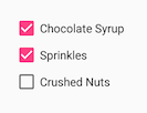
Each checkbox is a separate instance of the CheckBox class. You create each checkbox using a CheckBox element in your XML layout. To create multiple checkboxes in a vertical orientation, use a vertical LinearLayout:
<LinearLayout xmlns:android="http://schemas.android.com/apk/res/android"
        android:orientation="vertical"
        android:layout_width="fill_parent"
        android:layout_height="fill_parent">

        <CheckBox android:id="@+id/checkbox1_chocolate"
            android:layout_width="wrap_content"
            android:layout_height="wrap_content"
            android:text="@string/chocolate_syrup" />
        <CheckBox android:id="@+id/checkbox2_sprinkles"
            android:layout_width="wrap_content"
            android:layout_height="wrap_content"
            android:text="@string/sprinkles" />
        <CheckBox android:id="@+id/checkbox3_nuts"
            android:layout_width="wrap_content"
            android:layout_height="wrap_content"
            android:text="@string/crushed_nuts" />

</LinearLayout>
Typically programs retrieve the state of checkboxes when a user touches or clicks a Submit or Done button in the same activity, which uses the android:onClick attribute to call a method such as onSubmit():
<Button
   android:layout_width="wrap_content"
   android:layout_height="wrap_content"
   android:text="@string/submit"
   android:onClick="onSubmit"/>
The callback method—onSubmit() in the above Button example—must be public, return void, and define a View as a parameter (the view that was clicked). In this method you can determine if a checkbox is selected by using the isChecked() method (inherited from CompoundButton). The isChecked() method will return a (boolean) true if there is a checkmark in the box. For example, the following statement assigns the boolean value of true or false to checked depending on whether the checkbox is checked:
boolean checked = ((CheckBox) view).isChecked();
The following code snippet shows how the onSubmit() method might check to see which checkbox is selected, using the resource id for the checkbox element:
public void onSubmit(View view){
   StringBuffer toppings = new
                   StringBuffer().append(getString(R.string.toppings_label));
   if  (((CheckBox) findViewById(R.id.checkbox1_chocolate)).isChecked()) {
      toppings.append(getString(R.string.chocolate_syrup_text));
   }
   if  (((CheckBox) findViewById(R.id.checkbox2_sprinkles)).isChecked()) {
      toppings.append(getString(R.string.sprinkles_text));
   }
   if  (((CheckBox) findViewById(R.id.checkbox3_nuts)).isChecked()) {
      toppings.append(getString(R.string.crushed_nuts_text));
   }
...
}
Tip: To respond quickly to a checkbox—such as display a message (like an alert), or show a set of further options—you can use the android:onClick attribute in the XML layout for each checkbox to declare the callback method for that checkbox, which must be defined within the activity that hosts this layout.
For more information about checkboxes, see Checkboxes in the User Interface section of the Android Developer Documentation.
Radio buttons
Use radio buttons when you have two or more options that are mutually exclusive—the user must select only one of them. (If you want to enable more than one selection from the set, use checkboxes.)

Users expect radio buttons to appear as a vertical list, or side-by-side horizontally if the labels are short.
Each radio button is an instance of the RadioButton class. Radio buttons are normally used together in a RadioGroup. When several radio buttons live inside a radio group, checking one radio button unchecks all the others. You create each radio button using a RadioButton element in your XML layout within a RadioGroup view group:
<RadioGroup
        android:layout_width="match_parent"
        android:layout_height="wrap_content"
        android:orientation="vertical"
        android:layout_below="@id/orderintrotext">
        <RadioButton
            android:id="@+id/sameday"
            android:layout_width="wrap_content"
            android:layout_height="wrap_content"
            android:text="@string/same_day_messenger_service"
            android:onClick="onRadioButtonClicked"/>
        <RadioButton
            android:id="@+id/nextday"
            android:layout_width="wrap_content"
            android:layout_height="wrap_content"
            android:text="@string/next_day_ground_delivery"
            android:onClick="onRadioButtonClicked"/>
        <RadioButton
            android:id="@+id/pickup"
            android:layout_width="wrap_content"
            android:layout_height="wrap_content"
            android:text="@string/pick_up"
            android:onClick="onRadioButtonClicked"/>
    </RadioGroup>
Use the android:onClick attribute for each radio button to declare the click event handler method for the radio button, which must be defined within the activity that hosts this layout. In the above layout, clicking any radio button calls the same onRadioButtonClicked() method in the activity, but you could create separate methods in the activity and declare them in each radio button's android:onClick attribute.
The click event handler method must be public, return void, and define a View as its only parameter (the view that was clicked). The following shows one method, onRadioButtonClicked(), for all radio buttons, using switch case statements to check the resource id for the radio button element to determine which one was checked:
public void onRadioButtonClicked(View view) {
   // Check to see if a button has been clicked.
   boolean checked = ((RadioButton) view).isChecked();

   // Check which radio button was clicked.
   switch(view.getId()) {
      case R.id.sameday:
         if (checked)
            // Same day service
            break;
      case R.id.nextday:
         if (checked)
            // Next day delivery
            break;
      case R.id.pickup:
         if (checked)
            // Pick up
            break;
   }
}
Tip: To give users a chance to review their radio button selection before the app responds, you could implement a Submit or Done button as shown previously with checkboxes, and remove the android:onClick attributes from the radio buttons. Then add the onRadioButtonClicked() method to the android:onClick attribute for the Submit or Done button.
For more information about radio buttons, see "Radio Buttons" in the User Interface section of the Android Developer Documentation.
Toggle buttons and switches
A toggle input control lets the user change a setting between two states. Android provides the ToggleButton class, which shows a raised button with "OFF" and "ON".

Examples of toggles include the On/Off switches for Wi-Fi, Bluetooth, and other options in the Settings app.
Android also provides the Switch class, which is a short slider that looks like a rocker switch offering two states (on and off). Both are extensions of the CompoundButton class.

Using a toggle button
Create a toggle button by using a ToggleButton element in your XML layout:
<ToggleButton
        android:layout_width="wrap_content"
        android:layout_height="wrap_content"
        android:id="@+id/my_toggle"
        android:text="
        android:onClick="onToggleClick"/>
Tip: The android:text attribute does not provide a text label for a toggle button—the toggle button always shows either "ON" or "OFF". To provide a text label next to (or above) the toggle button, use a separate TextView.
To respond to the toggle tap, declare an android:onClick callback method for the ToggleButton. The method must be defined in the activity hosting the layout, and it must be public, return void, and define a View as its only parameter (this will be the view that was clicked). Use CompoundButton.OnCheckedChangeListener() to detect the state change of the toggle. Create a CompoundButton.OnCheckedChangeListener object and assign it to the button by calling setOnCheckedChangeListener(). For example, the onToggleClick() method checks whether the toggle is on or off, and displays a toast message:
public void onToggleClick(View view) {
   ToggleButton toggle = (ToggleButton) findViewById(R.id.my_toggle);
   toggle.setOnCheckedChangeListener(new
                              CompoundButton.OnCheckedChangeListener() {
      public void onCheckedChanged(CompoundButton buttonView,
                              boolean isChecked) {
         StringBuffer onOff = new StringBuffer().append("On or off? ");
         if (isChecked) { // The toggle is enabled
            onOff.append("ON ");
         } else { // The toggle is disabled
            onOff.append("OFF ");
         }
         Toast.makeText(getApplicationContext(), onOff.toString(),
                              Toast.LENGTH_SHORT).show();
      }
   });
}
Tip: You can also programmatically change the state of a ToggleButton using the setChecked(boolean) method. Be aware, however, that the method specified by the android:onClick() attribute will not be executed in this case.
Using a switch
A switch is a separate instance of the Switch class, which extends the CompoundButton class just like ToggleButton. Create a toggle switch by using a Switch element in your XML layout:
<Switch
        android:layout_width="wrap_content"
        android:layout_height="wrap_content"
        android:id="@+id/my_switch"
        android:text="@string/turn_on_or_off"
        android:onClick="onSwitchClick"/>
The android:text attribute defines a string that appears to the left of the switch, as shown below:

To respond to the switch tap, declare an android:onClick callback method for the Switch—the code is basically the same as for a ToggleButton. The method must be defined in the activity hosting the layout, and it must be public, return void, and define a View as its only parameter (this will be the view that was clicked). Use CompoundButton.OnCheckedChangeListener() to detect the state change of the switch. Create a CompoundButton.OnCheckedChangeListener object and assign it to the button by calling setOnCheckedChangeListener(). For example, the onSwitchClick() method checks whether the switch is on or off, and displays a toast message:
public void onSwitchClick(View view) {
   Switch aSwitch = (Switch) findViewById(R.id.my_switch);
   aSwitch.setOnCheckedChangeListener(new
                             CompoundButton.OnCheckedChangeListener() {
      public void onCheckedChanged(CompoundButton buttonView,
                             boolean isChecked) {
         StringBuffer onOff = new StringBuffer().append("On or off? ");
         if (isChecked) { // The switch is enabled
            onOff.append("ON ");
         } else { // The switch is disabled
            onOff.append("OFF ");
         }
         Toast.makeText(getApplicationContext(), onOff.toString(),
                             Toast.LENGTH_SHORT).show();
      }
   });
}
Tip: You can also programmatically change the state of a Switch using the setChecked(boolean) method. Be aware, however, that the method specified by the android:onClick() attribute will not be executed in this case.
For more information about toggles, see "Toggle Buttons" in the User Interface section of the Android Developer Documentation.
Spinners
A spinner provides a quick way to select one value from a set. Touching the spinner displays a drop-down list with all available values, from which the user can select one.
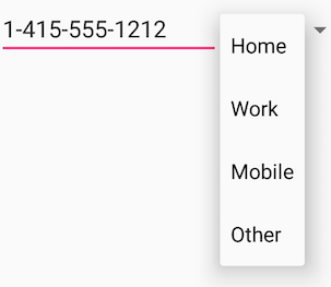
If you have a long list of choices, a spinner may extend beyond your layout, forcing the user to scroll it. A spinner scrolls automatically, with no extra code needed. However, scrolling a long list (such as a list of countries) is not recommended as it can be hard to select an item.
To create a spinner, use the Spinner class, which creates a view that displays individual spinner values as child views, and lets the user pick one. Follow these steps:
- Create a
Spinnerelement in your XML layout, and specify its values using an array and an ArrayAdapter. - Create the spinner and its adapter using the SpinnerAdapter class.
- To define the selection callback for the spinner, update the Activity that uses the spinner to implement the AdapterView.OnItemSelectedListener interface.
Create the spinner UI element
To create a spinner in your XML layout, add a Spinner element, which provides the drop-down list:
<Spinner
   android:id="@+id/label_spinner"
   android:layout_width="wrap_content"
   android:layout_height="wrap_content">
</Spinner>
Specify the values for the spinner
You add an adapter that fills the spinner list with values. An adapter is like a bridge, or intermediary, between two incompatible interfaces. For example, a memory card reader acts as an adapter between the memory card and a laptop. You plug the memory card into the card reader, and plug the card reader into the laptop, so that the laptop can read the memory card.
The spinner-adapter pattern takes the data set you've specified and makes a view for each item in the data set, as shown in the figure below.
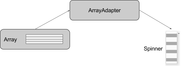
The SpinnerAdapter class, which implements the Adapter class, allows you to define two different views: one that shows the data values in the spinner itself, and one that shows the data in the drop-down list when the spinner is touched or clicked.
The values you provide for the spinner can come from any source, but must be provided through a SpinnerAdapter, such as an ArrayAdapter if the values are available in an array. The following shows a simple array called labels_array of predetermined values in the strings.xml file:
<string-array name="labels_array">
        <item>Home</item>
        <item>Work</item>
        <item>Mobile</item>
        <item>Other</item>
</string-array>
Tip: You can use a CursorAdapter if the values could come from a source such as a stored file or a database. You learn more about stored data in another chapter.
Create the spinner and its adapter
Create the spinner, and set its listener to the activity that implements the callback methods. The best place to do this is when the view is created in the onCreate() method. Follow these steps (refer to the full onCreate() method at the end of the steps):
- Add the code below to the
onCreate()method, which does the following: - Gets the spinner object you added to the layout using
findViewById()to find it by itsid(label_spinner). Sets the onItemSelectedListener to whichever activity implements the callbacks (
this) using the setOnItemSelectedListener() method.@Override protected void onCreate(Bundle savedInstanceState) { super.onCreate(savedInstanceState); setContentView(R.layout.activity_main); // Create the spinner. Spinner spinner = (Spinner) findViewById(R.id.label_spinner); if (spinner != null) { spinner.setOnItemSelectedListener(this); } }Also in the
onCreate()method, add a statement that creates the ArrayAdapter with the string array:// Create ArrayAdapter using the string array and default spinner layout. ArrayAdapter<CharSequence> adapter = ArrayAdapter.createFromResource(this, R.array.labels_array, android.R.layout.simple_spinner_item);As shown above, you use the createFromResource() method, which takes as arguments:
- The activity that implements the callbacks for processing the results of the spinner (
this) - The array (
labels_array) The layout for each spinner item (
layout.simple_spinner_item).Tip: You should use the
simple_spinner_itemdefault layout, unless you want to define your own layout for the items in the spinner.Specify the layout the adapter should use to display the list of spinner choices by calling the setDropDownViewResource() method of the ArrayAdapter class. For example, you can use
simple_spinner_dropdown_itemas your layout:// Specify the layout to use when the list of choices appears. adapter.setDropDownViewResource (android.R.layout.simple_spinner_dropdown_item);Tip: You should use the
simple_spinner_dropdown_itemdefault layout, unless you want to define your own layout for the spinner's appearance.- Use setAdapter() to apply the adapter to the spinner:
// Apply the adapter to the spinner. spinner.setAdapter(adapter);
The full code for the onCreate() method is shown below:
@Override
protected void onCreate(Bundle savedInstanceState) {
super.onCreate(savedInstanceState);
setContentView(R.layout.activity_main);
// Create the spinner.
Spinner spinner = (Spinner) findViewById(R.id.label_spinner);
if (spinner != null) {
spinner.setOnItemSelectedListener(this);
}
// Create ArrayAdapter using the string array and default spinner layout.
ArrayAdapter<CharSequence> adapter = ArrayAdapter.createFromResource(this,
            R.array.labels_array, android.R.layout.simple_spinner_item);
// Specify the layout to use when the list of choices appears.
adapter.setDropDownViewResource
                   (android.R.layout.simple_spinner_dropdown_item);
// Apply the adapter to the spinner.
if (spinner != null) {
spinner.setAdapter(adapter);
}
}
Implement the OnItemSelectedListener interface in the Activity
To define the selection callback for the spinner, update the Activity that uses the spinner to implement the AdapterView.OnItemSelectedListener interface:
public class MainActivity extends AppCompatActivity implements
            AdapterView.OnItemSelectedListener {
Android Studio automatically imports the AdapterView widget. Implement the AdapterView.OnItemSelectedListener interface in order to have the onItemSelected() and onNothingSelected() callback methods to use with the spinner object.
When the user chooses an item from the spinner's drop-down list, here's what happens and how you retrieve the item:
- The
Spinnerobject receives an on-item-selected event. - The event triggers the calling of the onItemSelected() callback method of the AdapterView.OnItemSelectedListener interface.
Retrieve the selected item in the spinner menu using the getItemAtPosition() method of the AdapterView class:
public void onItemSelected(AdapterView<?> adapterView, View view, int
               pos, long id) {
   String spinner_item = adapterView.getItemAtPosition(pos).toString();
}
The arguments for
onItemSelected()are as follows:parent AdapterViewThe AdapterView where the selection happened
view ViewThe view within the AdapterView that was clicked
int posThe position of the view in the adapter
long idThe row id of the item that is selected
- Implement/override the onNothingSelected() callback method of the AdapterView.OnItemSelectedListener interface to do something if nothing is selected.
For more information about spinners, see Spinners in the "User Interface" section of the Android Developer Documentation.
Text input
Use the EditText class to get user input that consists of textual characters, including numbers and symbols. EditText extends the TextView class, to make the TextView editable.
Customizing an EditText object for user input
In the Layout Manager of Android Studio, create an EditText view by adding an EditText to your layout with the following XML:
<EditText
    android:id="@+id/edit_simple"
    android:layout_height="wrap_content"
    android:layout_width="match_parent">
</EditText>
Enabling multiple lines of input
By default, the EditText view allows multiple lines of input as shown in the figure below, and suggests spelling corrections. Tapping the Return (also known as Enter) key on the on-screen keyboard ends a line and starts a new line in the same EditText view.
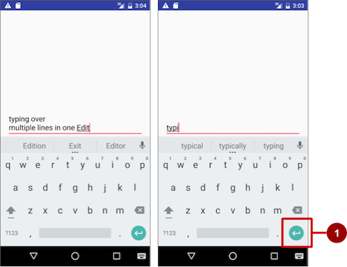
Enabling Return to advance to the next view
If you add the android:inputType attribute to the EditText view with a value such as "textCapCharacters" (to change the input to all capital letters) or "textAutoComplete" (to enable spelling suggestions as the user types), tapping the Return key closes the on-screen keyboard and advances the focus to the next view. This behavior is useful if you want the user to fill out a form consisting of EditText fields, so that the user can advance quickly to the next EditText view.
Attributes for customizing an EditText view
Use attributes to customize the EditText view for input. For example:
android:maxLines="1": Set the text entry to show only one line.android:lines="2": Set the text entry to show 2 lines, even if the length of the text is less.android:maxLength="5": Set the maximum number of input characters to 5.android:inputType="number": Restrict text entry to numbers.android:digits="01": Restrict the digits entered to just "0" and "1".android:textColorHighlight="#7cff88": Set the background color of selected (highlighted) text.android:hint="@string/my_hint": Set text to appear in the field that provides a hint for the user, such as "Enter a message".
For a list of EditText attributes, including inherited TextView attributes, see the "Summary" of the EditText class description.
Getting the user's input
Enabling the user to input text is only useful if you can use that text in some way in your app. To use the input, you must first get it from the EditText view in the XML layout. The steps you follow to set up the EditText view and get user input from it are:
- Create the EditText view element in the XML layout for an activity. Be sure to identify this element with an
android:idso that you can refer to it by itsid:android:id="@+id/editText_main" - In the Java code for the same activity, create a method with a
Viewparameter that gets theEditTextobject (in the example below,editText) for theEditTextview, using the findViewById() method of the View class to find the view by its id (editText_main):EditText editText = (EditText) findViewById(R.id.editText_main); - Use the getText() method of the EditText class (inherited from the TextView class) to obtain the text as a character sequence (CharSequence). You can convert the character sequence into a string using the toString() method of the CharSequence class, which returns a string representing the data in the character sequence.
String showString = editText.getText().toString();
Tip: You can use the valueOf() method of the Integer class to convert the string to an integer if the input is an integer.
Changing keyboards and input behaviors
The Android system shows an on-screen keyboard—known as a soft input method—when a text field in the UI receives focus. To provide the best user experience, you can specify characteristics about the type of input the app expects, such as whether it's a phone number or email address. You can also specify how the input method should behave, such as whether or not it shows spelling suggestions or provides capital letters for the beginning of a sentence. You can change the soft input method to a numeric keypad for entering only numbers, or even a phone keypad for phone numbers.
Android also provides an extensible framework for advanced programmers to develop and install their own Input Method Editors (IME) for speech input, specific types of keyboard entry, and other applications.
Declare the input method by adding the android:inputType attribute to the EditText view. For example, the following attribute sets the on-screen keyboard to be a phone keypad:
android:inputType="phone"
Use the android:inputType attribute with the following values:
textCapSentences: Set the keyboard to capital letters at the beginning of a sentence.textAutoCorrect: Enable spelling suggestions as the user types.textPassword: Turn each character the user enters into a dot to conceal an entered password.textEmailAddress: For email entry, show an email keyboard with the "@" symbol conveniently located next to the space key.phone: For phone number entry, show a numeric phone keypad.
Tip: You can use the pipe (|) character (Java bitwise OR) to combine attribute values for the android:inputType attribute:
android:inputType="textAutoCorrect|textCapSentences"
For details about the android:inputType attribute, see Specifying the Input Method Type in the developer documentation. For a complete list of constant values for android:inputType, see the "android:inputType" section of the TextView documentation.
Changing the "action" key in the keyboard
On Android devices, the "action" key is the Return key. This key is normally used to enter another line of text for an EditText element that allows multiple lines. If you set an android:inputType attribute for the EditText view with a value such as "textCapCharacters" (to change the input to all capital letters) or "textAutoComplete" (to enable spelling suggestions as the user types), the Return key closes the on-screen keyboard and advances the focus to the next view.
If you want the user to enter something other than text, such as a phone number, you may want to change the "action" key to an icon for a Send key, and change the action to be dialing a phone number. Follow these steps:
Use the
android:inputTypeattribute to set an input type for the keyboard:<EditText android:id="@+id/phone_number" android:inputType="phone" ... > </EditText>The
android:inputTypeattribute, in the above example, sets the keyboard type tophone, which forces one line of input (for a phone number).- Use
setOnEditorActionListener()to set the listener for the EditText view to respond to the use of the "action" key:EditText editText = (EditText) findViewById(R.id.phone_number); editText.setOnEditorActionListener(new TextView.OnEditorActionListener() { // Add onEditorAction() method } - Use the
IME_ACTION_SENDconstant in the EditorInfo class for theactionIdto show a Send key as the "action" key, and create a method to respond to the pressed Send key (in this case,dialNumberto dial the entered phone number):@Override public boolean onEditorAction(TextView textView, int actionId, KeyEvent keyEvent) { boolean handled = false; if (actionId == EditorInfo.IME_ACTION_SEND) { dialNumber(); handled = true; } return handled; });Note: For help setting the listener, see "Specifying the Input ActionSpecifying Keyboard Actions" in Text Fields. For more information about the EditorInfo class, see the EditorInfo documentation.
Using dialogs and pickers
A dialog is a window that appears on top of the display or fills the display, interrupting the flow of activity. Dialogs inform users about a specific task and may contain critical information, require decisions, or involve multiple tasks.
For example, you would typically use a dialog to show an alert that requires users to tap a button make a decision, such as OK or Cancel. In the figure below, the left side shows an alert with Disagree and Agree buttons, and the center shows an alert with Cancel and Discard buttons.
You can also use a dialog to provide choices in the style of radio buttons, as shown on the right side of the figure below.
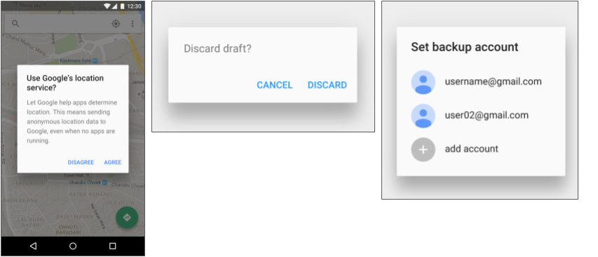
The base class for all dialog components is a Dialog. There are several useful Dialog subclasses for alerting the user on a condition, showing status or progress, displaying information on a secondary device, or selecting or confirming a choice, as shown on the left side of the figure below. The Android SDK also provides ready-to-use dialog subclasses such as pickers for picking a time or a date, as shown on the right side of the figure below. Pickers allow users to enter information in a predetermined, consistent format that reduces the chance for input error.
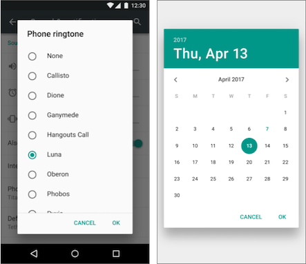
Dialogs always retain focus until dismissed or a required action has been taken.
Tip: Best practices recommend using dialogs sparingly as they interrupt the user's work flow. Read the Dialogs design guide for additional best design practices, and Dialogs in the Android developer documentation for code examples.
The Dialog class is the base class for dialogs, but you should avoid instantiating Dialog directly unless you are creating a custom dialog. For standard Android dialogs, use one of the following subclasses:
- AlertDialog: A dialog that can show a title, up to three buttons, a list of selectable items, or a custom layout.
- DatePickerDialog or TimePickerDialog: A dialog with a pre-defined UI that lets the user select a date or time.
Showing an alert dialog
Alerts are urgent interruptions, requiring acknowledgement or action, that inform the user about a situation as it occurs, or an action before it occurs (as in discarding a draft). You can provide buttons in an alert to make a decision. For example, an alert dialog might require the user to click Continue after reading it, or give the user a choice to agree with an action by clicking a positive button (such as OK or Accept), or to disagree by clicking a negative button (such as Disagree or Cancel).
Use the AlertDialog subclass of the Dialog class to show a standard dialog for an alert. The AlertDialog class allows you to build a variety of dialog designs. An alert dialog can have the following regions (refer to the diagram below):
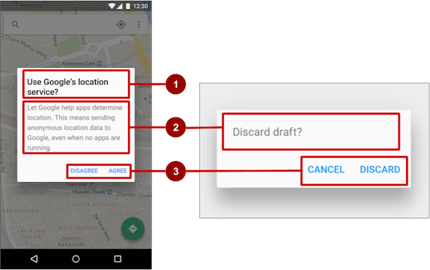
- Title: A title is optional. Most alerts don't need titles. If you can summarize a decision in a sentence or two by either asking a question (such as, "Discard draft?") or making a statement related to the action buttons (such as, "Click OK to continue"), don't bother with a title. Use a title if the situation is high-risk, such as the potential loss of connectivity or data, and the content area is occupied by a detailed message, a list, or custom layout.
- Content area: The content area can display a message, a list, or other custom layout.
- Action buttons: You should use no more than three action buttons in a dialog, and most have only two.
Building the AlertDialog
The AlertDialog.Builder class uses the builder design pattern, which makes it easy to create an object from a class that has a lot of required and optional attributes and would therefore require a lot of parameters to build. Without this pattern, you would have to create constructors for combinations of required and optional attributes; with this pattern, the code is easier to read and maintain. For more information about the builder design pattern, see Builder pattern.
Use AlertDialog.Builder to build a standard alert dialog and set attributes on the dialog. Use setTitle() to set its title, setMessage() to set its message, and setPositiveButton() and setNegativeButton() to set its buttons.
AlertDialog.Builder is not recognized as you enter it, you may need to add the following import statements to MainActivity.java:
import android.content.DialogInterface;
import android.support.v7.app.AlertDialog;
The following creates the dialog object (myAlertBuilder) and sets the title (the string resource called alert_title) and message (the string resource called alert_message):
AlertDialog.Builder myAlertBuilder = new
                  AlertDialog.Builder(MainActivity.this);
myAlertBuilder.setTitle(R.string.alert_title);
myAlertBuilder.setMessage(R.string.alert_message);
Setting the button actions for the alert dialog
Use the setPositiveButton() and setNegativeButton() methods of the AlertDialog.Builder class to set the button actions for the alert dialog. These methods require a title for the button (supplied by a string resource) and the DialogInterface.OnClickListener class that defines the action to take when the user presses the button:
myAlertBuilder.setPositiveButton("OK", new DialogInterface.OnClickListener() {
      public void onClick(DialogInterface dialog, int which) {
           // User clicked OK button.
      }
});
myAlertBuilder.setNegativeButton("Cancel", new DialogInterface.OnClickListener() {
      public void onClick(DialogInterface dialog, int which) {
         // User clicked the CANCEL button.
      }
   });
You can add only one of each button type to an AlertDialog. For example, you can't have more than one "positive" button.
Tip: You can also set a "neutral" button with setNeutralButton(). The neutral button appears between the positive and negative buttons. Use a neutral button, such as "Remind me later", if you want the user to be able to dismiss the dialog and decide later.
Displaying the dialog
To display the dialog, call its show() method:
alertDialog.show();
Date and time pickers
Android provides ready-to-use dialogs, called pickers, for picking a time or a date. Use them to ensure that your users pick a valid time or date that is formatted correctly and adjusted to the user's locale. Each picker provides controls for selecting each part of the time (hour, minute, AM/PM) or date (month, day, year).
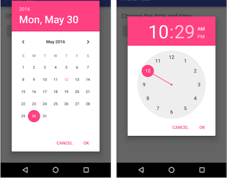
When showing a picker, you should use an instance of DialogFragment, a subclass of Fragment, which displays a dialog window floating on top of its activity's window. A fragment is a behavior or a portion of user interface within an activity. It's like a mini-activity within the main activity, with its own individual lifecycle. A fragment receives its own input events, and you can add or remove it while the main activity is running. You might combine multiple fragments in a single activity to build a multiple-pane user interface, or reuse a fragment in multiple activities. To learn about fragments, see Fragments in the API Guide.
One benefit of using fragments for the pickers is that you can isolate the code sections for managing the date and the time after the user selects them from the pickers. You can also use DialogFragment to manage the dialog lifecycle.
Tip: Another benefit of using fragments for the pickers is that you can implement different layout configurations, such as a basic dialog on handset-sized displays or an embedded part of a layout on large displays.
Adding a fragment
To add a fragment for the date picker, create a blank fragment (DatePickerFragment) without a layout XML, and without factory methods or interface callbacks:
- Expand app > java > com.example.android.DateTimePickers and select MainActivity.
- Choose File > New > Fragment > Fragment (Blank), and name the fragment DatePickerFragment. Uncheck all three checkbox options so that you do not create a layout XML, do not include fragment factory methods, and do not include interface callbacks. You don't need to create a layout for a standard picker. Click Finish to create the fragment.
Extending DialogFragment for the picker
The next step is to create a standard picker with a listener. Follow these steps:
Edit the
DatePickerFragmentclass definition to extendDialogFragment,and implementDatePickerDialog.OnDateSetListenerto create a standard date picker with a listener:public class DatePickerFragment extends DialogFragment implements DatePickerDialog.OnDateSetListener { ... }Android Studio automatically adds the following in the import block at the top:
import android.app.DatePickerDialog.OnDateSetListener;
import android.support.v4.app.DialogFragment;
Android Studio also shows a red light bulb icon in the left margin, prompting you to implement methods. Click the icon and, with onDateSet already selected and the "Insert @Override" option checked, click OK to create the empty onDateSet() method.
Android Studio then automatically adds the following in the import block at the top:
import android.widget.DatePicker;Replace
onCreateView()withonCreateDialog():@Override public Dialog onCreateDialog(Bundle savedInstanceState) { }When you extend
DialogFragment, you should override the onCreateDialog() callback method, rather thanonCreateView. You use your version of the callback method to initialize theyear,month, anddayfor the date picker.
Setting the defaults and returning the picker
To set the default date in the picker and return it as an object you can use, follow these steps:
Add the following code to the
onCreateDialog()method to set the default date for the picker:// Use the current date as the default date in the picker. final Calendar c = Calendar.getInstance(); int year = c.get(Calendar.YEAR); int month = c.get(Calendar.MONTH); int day = c.get(Calendar.DAY_OF_MONTH);As you enter
Calendar, you are given a choice of which Calendar library to import. Choose this one:import java.util.Calendar;The Calendar class sets the default date as the current date—it converts between a specific instant in time and a set of calendar fields such as
YEAR,MONTH,DAY_OF_MONTH,HOUR, and so on. Calendar is locale-sensitive, and its class methodgetInstance()returns a Calendar object whose calendar fields have been initialized with the current date and time.- Add the following statement to the end of the method to create a new instance of the date picker and return it:
return new DatePickerDialog(getActivity(), this, year, month, day);
Showing the picker
In the Main Activity, you need to create a method to show the date picker. Follow these steps:
- Create a method to instantiate the date picker dialog fragment:
public void showDatePickerDialog(View v) { DialogFragment newFragment = new DatePickerFragment(); newFragment.show(getSupportFragmentManager(), "datePicker"); } - You can then use
showDatePickerDialog()with theandroid:onClickattribute for a button or other input control:<Button android:id="@+id/button_date" ... android:onClick="showDatePickerDialog"/>
Processing the user's picker choice
The onDateSet() method is automatically called when the user makes a selection in the date picker, so you can use this method to do something with the chosen date. Follow these steps:
- To make the code more readable, change the
onDateSet()method's parameters fromint i,int i1, andint i2toint year,int month, andint day:public void onDateSet(DatePicker view, int year, int month, int day) { - Open MainActivity and add the
processDatePickerResult()method signature that takes theyear,month, anddayas arguments:public void processDatePickerResult(int year, int month, int day) { } Add the following code to the
processDatePickerResult()method to convert themonth,day, andyearto separate strings:String month_string = Integer.toString(month+1); String day_string = Integer.toString(day); String year_string = Integer.toString(year);Note: Themonthinteger returned by the date picker starts counting at 0 for January, so you need to add 1 to it to start show months starting at 1.Add the following after the above code to concatenate the three strings and include slash marks for the U.S. date format:
String dateMessage = (month_string + "/" + day_string + "/" + year_string);- Add the following after the above statement to display a Toast message:
Toast.makeText(this, "Date: " + dateMessage, Toast.LENGTH_SHORT).show(); - Extract the hard-coded string
"Date: "into a string resource nameddate. This automatically replaces the hard-coded string withgetString(R.string.date). The code for theprocessDatePickerResult()method should now look like this:public void processDatePickerResult(int year, int month, int day) { String month_string = Integer.toString(month + 1); String day_string = Integer.toString(day); String year_string = Integer.toString(year); // Assign the concatenated strings to dateMessage. String dateMessage = (month_string + "/" + day_string + "/" + year_string); Toast.makeText(this, getString(R.string.date) + dateMessage, Toast.LENGTH_SHORT).show(); } Open DatePickerFragment, and add the following to the
onDateSet()method to invoke theprocessDatePickerResult()method inMainActivityand pass it theyear,month, andday:public void onDateSet(DatePicker view, int year, int month, int day) { // Set the activity to the Main Activity. MainActivity activity = (MainActivity) getActivity(); // Invoke Main Activity's processDatePickerResult() method. activity.processDatePickerResult(year, month, day); }You use
getActivity()which, when used in a fragment, returns the activity the fragment is currently associated with. You need this because you can't call a method inMainActivitywithout the context ofMainActivity(you would have to use anintentinstead, as you learned in a previous lesson). The activity inherits the context, so you can use it as the context for calling the method (as inactivity.processDatePickerResult).
Using the same procedures for the time picker
Follow the same procedures outlined above for a date picker:
- Add a blank fragment called TimePickerFragment that extends
DialogFragmentand implementsTimePickerDialog.OnTimeSetListener:public class TimePickerFragment extends DialogFragment implements TimePickerDialog.OnTimeSetListener { Add with
@Overridea blankonTimeSet()method:Android Studio also shows a red light bulb icon in the left margin, prompting you to implement methods. Click the icon and, with onTimeSet already selected and the "Insert @Override" option checked, click OK to create the empty onTimeSet() method. Android Studio then automatically adds the following in the import block at the top:
import android.widget.TimePicker;Use
onCreateDialog()to initialize the time and return the dialog:public Dialog onCreateDialog(Bundle savedInstanceState) { // Use the current time as the default values for the picker. final Calendar c = Calendar.getInstance(); int hour = c.get(Calendar.HOUR_OF_DAY); int minute = c.get(Calendar.MINUTE); // Create a new instance of TimePickerDialog and return it. return new TimePickerDialog(getActivity(), this, hour, minute, DateFormat.is24HourFormat(getActivity())); }Show the picker: Open MainActivity and create a method to instantiate the date picker dialog fragment:
public void showDatePickerDialog(View v) {
        DialogFragment newFragment = new DatePickerFragment();
        newFragment.show(getSupportFragmentManager(), "datePicker");
}
Use
showDatePickerDialog()with theandroid:onClickattribute for a button or other input control:<Button android:id="@+id/button_date" ... android:onClick="showDatePickerDialog"/>- Create the
processTimePickerResult()method in MainActivity to process the result of choosing from the time picker:public void processTimePickerResult(int hourOfDay, int minute) { // Convert time elements into strings. String hour_string = Integer.toString(hourOfDay); String minute_string = Integer.toString(minute); // Assign the concatenated strings to timeMessage. String timeMessage = (hour_string + ":" + minute_string); Toast.makeText(this, getString(R.string.time) + timeMessage, Toast.LENGTH_SHORT).show(); } - Use
onTimeSet()to get the time and pass it to theprocessTimePickerResult()method in MainActivity:public void onTimeSet(TimePicker view, int hourOfDay, int minute) { // Set the activity to the Main Activity. MainActivity activity = (MainActivity) getActivity(); // Invoke Main Activity's processTimePickerResult() method. activity.processTimePickerResult(hourOfDay, minute); }
You can read all about setting up pickers in Pickers.
Recognizing gestures
A touch gesture occurs when a user places one or more fingers on the touch screen, and your app interprets that pattern of touches as a particular gesture, such as a long touch, double-tap, fling, or scroll.
Android provides a variety of classes and methods to help you create and detect gestures. Although your app should not depend on touch gestures for basic behaviors (since the gestures may not be available to all users in all contexts), adding touch-based interaction to your app can greatly increase its usefulness and appeal.
To provide users with a consistent, intuitive experience, your app should follow the accepted Android conventions for touch gestures. The Gestures design guide shows you how to design common gestures in Android apps. For more code samples and details, see Using Touch Gestures in the Android developer documentation.
Detecting common gestures
If your app uses common gestures such as double tap, long press, fling, and so on, you can take advantage of the GestureDetector class for detecting common gestures. Use GestureDetectorCompat, which is provided as a compatibility implementation of the framework's GestureDetector class which guarantees the newer focal point scrolling behavior from Jellybean MR1 on all platform versions. This class should be used only with motion events reported for touch devices—don't use it for trackball or other hardware events.
GestureDetectorCompat lets you detect common gestures without processing the individual touch events yourself. It detects various gestures and events using MotionEvent objects, which report movements by a finger (or mouse, pen, or trackball).
The following snippets show how you would use GestureDetectorCompat and the GestureDetector.SimpleOnGestureListener class.
To use GestureDetectorCompat, create an instance (
mDetectorin the snippet below) of theGestureDetectorCompatclass, using theonCreate()method in the activity (such as MainActivity):public class MainActivity extends Activity { private GestureDetectorCompat mDetector; @Override public void onCreate(Bundle savedInstanceState) { super.onCreate(savedInstanceState); setContentView(R.layout.activity_main); mDetector = new GestureDetectorCompat(this, new MyGestureListener()); } ... }
When you instantiate a GestureDetectorCompat object, one of the parameters it takes is a class you must create—MyGestureListener in the above snippet—that does one of the following:
- implements the GestureDetector.OnGestureListener interface, to detect all standard gestures, or
- extends the GestureDetector.SimpleOnGestureListener class, which you can use to process only a few gestures by overriding the methods you need. Some of the methods it provides include onDown(), onLongPress(), onFling(), onScroll(), and onSingleTapUp().
Create the class
MyGestureListeneras a separate activity (MyGestureListener)to extendGestureDetector.SimpleOnGestureListener, and override the onFling() and onDown() methods to show log statements about the event:class MyGestureListener extends GestureDetector.SimpleOnGestureListener { private static final String DEBUG_TAG = "Gestures"; @Override public boolean onDown(MotionEvent event) { Log.d(DEBUG_TAG,"onDown: " + event.toString()); return true; } @Override public boolean onFling(MotionEvent event1, MotionEvent event2, float velocityX, float velocityY) { Log.d(DEBUG_TAG, "onFling: " + event1.toString()+event2.toString()); return true; } }- To intercept touch events, override the onTouchEvent() callback of the GestureDetectorCompat class in MainActivity:
@Override
public boolean onTouchEvent(MotionEvent event){
  this.mDetector.onTouchEvent(event);
  return super.onTouchEvent(event);
}
Detecting all gestures
To detect all types of gestures, you need to perform two essential steps:
- Gather data about touch events.
- Interpret the data to see if it meets the criteria for any of the gestures your app supports.
The gesture starts when the user first touches the screen, continues as the system tracks the position of the user's finger(s), and ends by capturing the final event of the user's fingers leaving the screen. Throughout this interaction, an object of the MotionEvent class is delivered to onTouchEvent(), providing the details of every interaction. Your app can use the data provided by the MotionEvent to determine if a gesture it cares about happened.
For example, when the user first touches the screen, the onTouchEvent() method is triggered on the view that was touched, and a MotionEvent object reports movement by a finger (or mouse, pen, or trackball) in terms of:
- An action code: Specifies the state change that occurred, such as a finger tapping down or lifting up.
- A set of axis values: Describes the position in X and Y coordinates of the touch and information about the pressure, size and orientation of the contact area.
The individual fingers or other objects that generate movement traces are referred to as pointers. Some devices can report multiple movement traces at the same time. Multi-touch screens show one movement trace for each finger. Motion events contain information about all of the pointers that are currently active even if some of them have not moved since the last event was delivered. Based on the interpretation of the MotionEvent object, the onTouchEvent() method triggers the appropriate callback on the GestureDetector.OnGestureListener interface.
Each MotionEvent pointer has a unique id that is assigned when it first goes down (indicated by ACTION_DOWN or ACTION_POINTER_DOWN). A pointer id remains valid until the pointer eventually goes up (indicated by ACTION_UP or ACTION_POINTER_UP) or when the gesture is canceled (indicated by ACTION_CANCEL). The MotionEvent class provides methods to query the position and other properties of pointers, such as getX(int), getY(int), getAxisValue(int), getPointerId(int), and getToolType(int).
The interpretation of the contents of a MotionEvent varies significantly depending on the source class of the device. On touch screens, the pointer coordinates specify absolute positions such as view X/Y coordinates. Each complete gesture is represented by a sequence of motion events with actions that describe pointer state transitions and movements.
A gesture starts with a motion event with ACTION_DOWN that provides the location of the first pointer down. As each additional pointer goes down or up, the framework generates a motion event with ACTION_POINTER_DOWN or ACTION_POINTER_UP accordingly. Pointer movements are described by motion events with ACTION_MOVE. A gesture ends when the final pointer goes up as represented by a motion event with ACTION_UP, or when the gesture is canceled with ACTION_CANCEL.
To intercept touch events in an activity or view, override the onTouchEvent() callback as shown in the snippet below. You can use the getActionMasked() method of the MotionEventCompat class to extract the action the user performed from the event parameter. (MotionEventCompat is a helper for accessing features in a MotionEvent, which was introduced after API level 4 in a backwards compatible fashion.) This gives you the raw data you need to determine if a gesture you care about occurred:
public class MainActivity extends Activity {
...
// This example shows an Activity, but you would use the same approach if
// you were subclassing a View.
   @Override
   public boolean onTouchEvent(MotionEvent event){

       int action = MotionEventCompat.getActionMasked(event);

       switch(action) {
          case (MotionEvent.ACTION_DOWN) :
             Log.d(DEBUG_TAG,"Action was DOWN");
             return true;
          case (MotionEvent.ACTION_MOVE) :
             Log.d(DEBUG_TAG,"Action was MOVE");
             return true;
          case (MotionEvent.ACTION_UP) :
             Log.d(DEBUG_TAG,"Action was UP");
             return true;
          case (MotionEvent.ACTION_CANCEL) :
             Log.d(DEBUG_TAG,"Action was CANCEL");
             return true;
          case (MotionEvent.ACTION_OUTSIDE) :
             Log.d(DEBUG_TAG,"Movement occurred outside bounds " +
                    "of current screen element");
             return true;
          default :
             return super.onTouchEvent(event);
    }
}
You can then do your own processing on these events to determine if a gesture occurred.
Related practical
The related exercises and practical documentation is in Android Developer Fundamentals: Practicals.
Learn more
- Android API Guide, "Develop" section:
- Material Design Spec:
- Developer Blog:
